Logos & the Google Mutation

Why some businesses change their look
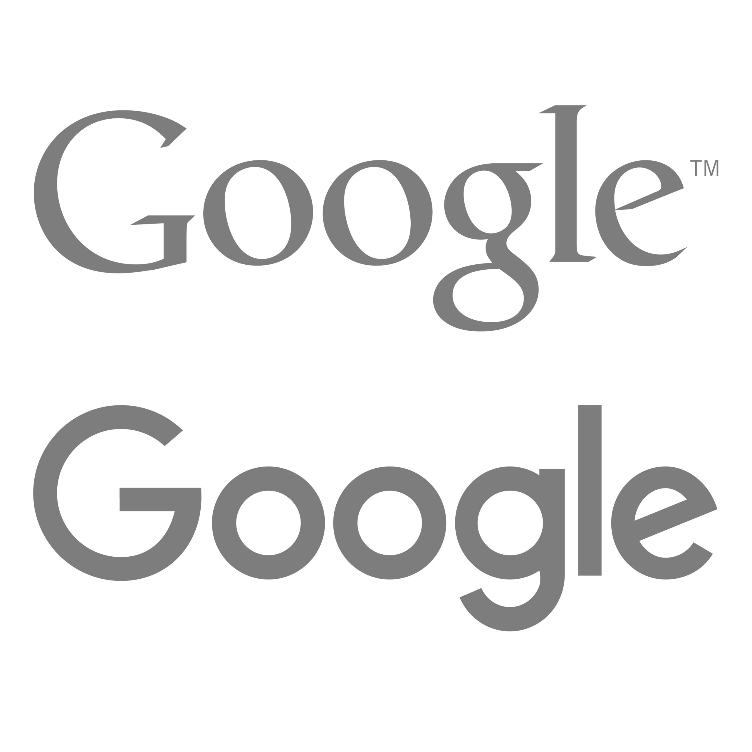
The Previous Google Logo, Compared with the Latest logo.
We shall all remember the 1st of September — the day the internet went into meltdown; the day that sparked arguments and approvals and unabashed anger; the day…
That Google changed their logo.
For 16 years, we have known the same six letters. We were intimately familiar with those four colours, those sharp serifs, that rigid professionality. And now, though some may scoff at the apparent overreactions, many can say with absolute certainty which logo their prefer.
A time for change:
So why do some businesses change their look?
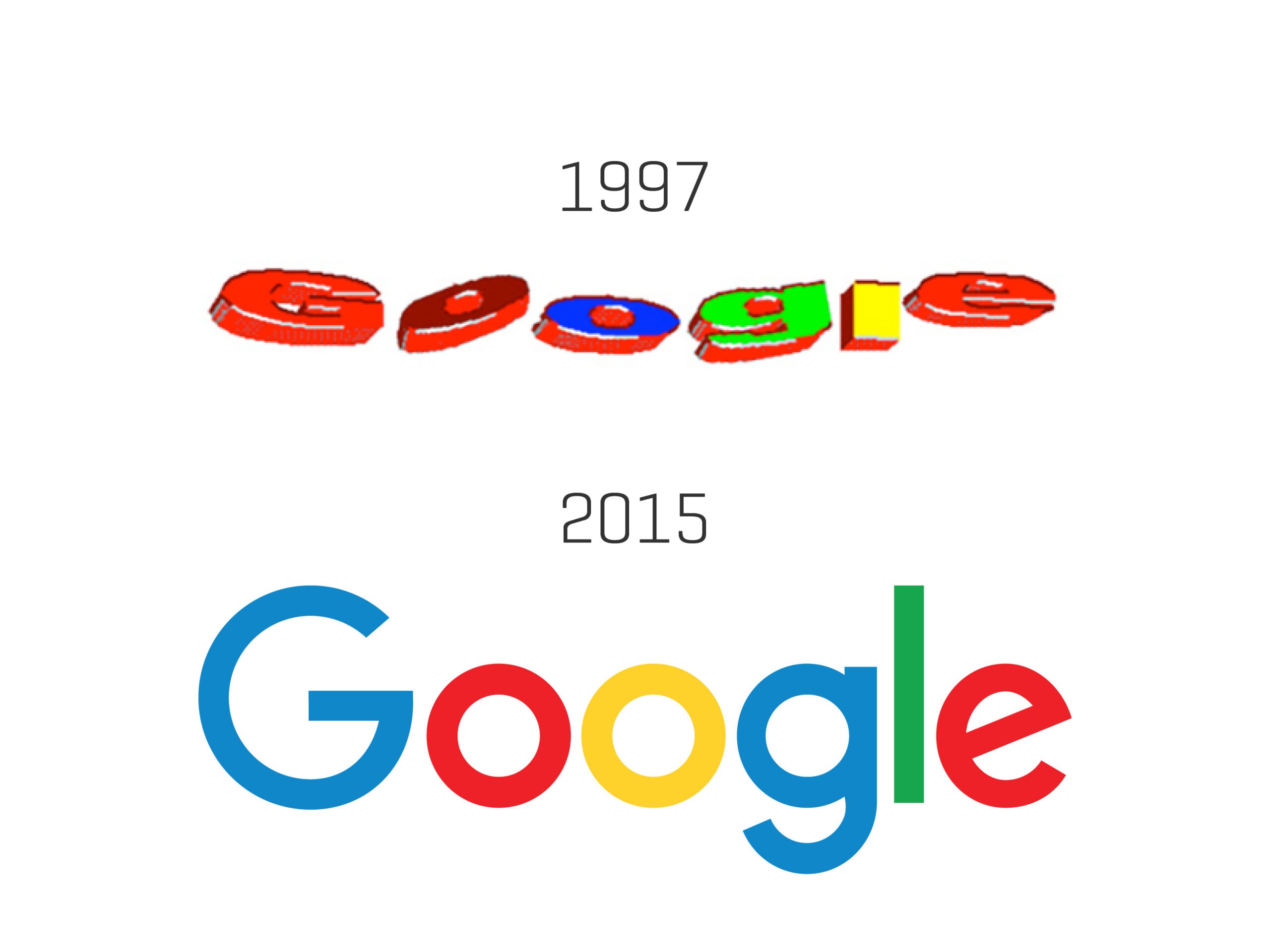
For Google in particular, it was a matter of reflecting reality. No longer is Google a destination reached only through a desktop computer. It has become a wide collection of services to be accessed on smartphones, televisions, watches, or even the dashboard of your car.
In response, the new sans-serif logo is ‘simple, uncluttered, colourful, friendly’, works well in constrained spaces, and remains consistent in appearance, regardless of where or how you see it.
So to summarise: some businesses will change their logo, their design, or their overall look in order to reflect the passing of time. A new logo can be like a rebirth for the business — a signifier of the brand’s aspirations to remain current, seamless, and responsive to trends.
Another understandable reason for changing a logo is if the business itself changes. It may merge with another company, start offering new services or products, or adopt a new philosophy. As the business develops, it may display a new look to complement its evolution.
A time for sameness:
With all that being said, arguments can also be made for the need of companies to remain true to the branding that their customers know, recognise and appreciate.
Google expressed this understanding; despite the radical change from crisp serifs to clean simplicity, the renowned colouring of the logo remained the same.
Meanwhile, Coca-Cola established its familiar Spencerian logo back in the 1880s and — except for a single year in which it sported an odd, swirly makeover — the typeface has remained consistent ever since. Why? Because it is recognised worldwide.
Compare Coca-Cola and Pepsi. The former constantly trumps the latter in the soft drink market, and this may be due, in part, to branding. The Coca-Cola logo is timeless and so well-known that most people, if asked, could give an accurate description of it from memory. Pepsi, meanwhile, has undergone many significant changes, from a curly red typeface to a bottle-cap to the red-and-blue logo that have today (and for now).
In this instance, chasing trends and seeking an exciting new look has resulted in an inconsistent, comparably forgettable look for the competing company.
Knowing what to do:
At the end of the day, the customer is always right.
Whether or not a business changes the logo, typeface, design, or look of their branding should be a response to the wants and needs of their consumers and the evolving world they live in.
The team at nucleo can help you assess your business’s logo and identify if it is:
- Timeless (and unlikely to need to be updated to become eye-catching)
- Technically versatile (and able to convert across all platforms)
- Suited to your business (and conveys who you are and what you do)
- Identifiable (and thus a strong symbol for your business)
Logos can be tricky. They do not ostensibly help people to make purchasing decisions, but they certainly act as an identifier for your business. Make sure you get the right look.
Contact nucleo today to find out more.