Daily Designer Decisions
7 impossible choices our designers make every day
Decisions, decisions, decisions. A designer’s life is filled with them. Pushing pixels, playing with palettes, placing and replacing words, shapes and layers… how’s a designer supposed to know what to do?
The ability to make confident and constructive choices is what sets the great designers apart from the good ones. But even great designers could feel overwhelmed by the sheer volume of difficult decisions that face them every day…
Decision #1: Colour
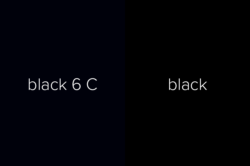
Most people won’t suffer an existential crisis when asked to choose between ‘Black 6 C’ and ‘7547 XGC’. They’re both black, right? (Cue indignant muttering from designers everywhere.) But in fact, colour choice is a huge and repeating concern for designers. And we’re not just talking the difference between red and blue — even the choice between two similar-looking tones can have an impact on the final design.
Decision #2: Typography
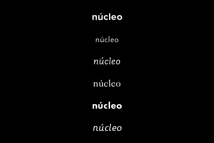
Font choices, like colours, are varied and significant. Our designers each have their favourite typefaces (‘Team Univers’ up in here), and will frequently gravitate towards a group of streamlined, ‘perfect’ choices — the sort of typography that can be used virtually anywhere effectively, like Helvetica, Franklin Gothic and Comic Sans. (We’re kidding about that last one.) But a great designer will consider all forms of serif, sans serif, script and display fonts to find the ideal choice for the specific client and project.
Decision #3: Style
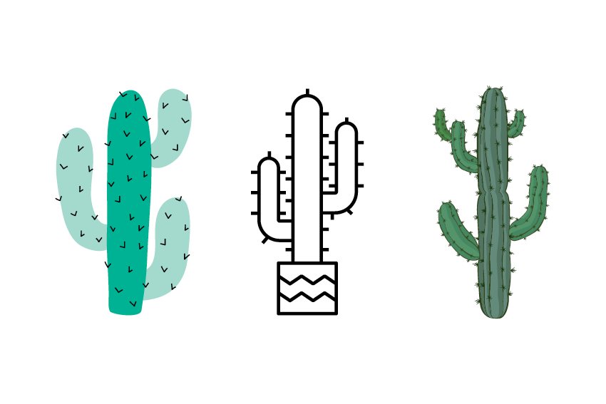
Here’s a big question for designers: …how? How are you going to make this design look? How are you going to make it work? How can you most effectively portray a brand through your design? We’re talking about style. Maybe you’ll hop aboard the trend train, utilising popular styles like minimalism, modern-retro or Flat 2.0. Or maybe you’ll opt for tried-and-true design features like geometric shapes, negative space, or bright and bold colours. No two styles are the same, and each will drastically change the results of a creative project.
Decision #4: Positioning
Text alignment, object placement, call-to-action (CTA) positioning — so many decisions, so little time. Whether they’re working with pixels or print, designers face a great internal struggle for the placement of each individual element in their design. Should this heading be left-justified? Would the ‘rule of thirds’ work well here? I’m starting to get a headache from all these choices…
Decision #5: Materials
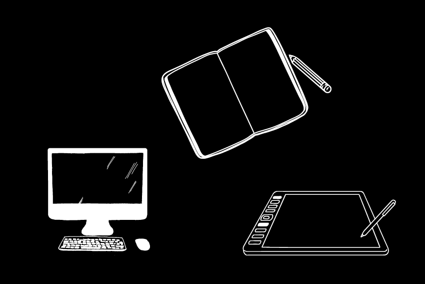
Designers: choose your weapon. The freedom of paper and pencil, or the orderly structure of a gridded sketchbook and a fineliner? The laptop on your desk, or a tablet on the move? A Mac or a PC (and the designers laughed and laughed and laughed…)? Designers may choose different materials at different stages of the design, but it’s important to note that the decision in design tools will produce unique results — a sleek, geometric, digitally-made logo will differ greatly from (and evoke different emotions than) an organic, hand-illustrated image.
Decision #6: Workspace
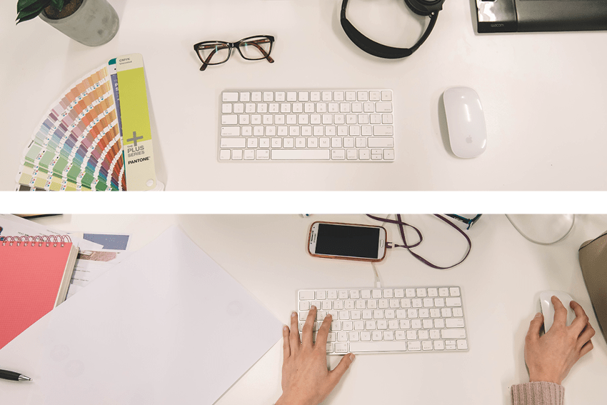
A designer’s decisions even include their workspace. For some, this may be a home studio, but for the nucleo designers, it means their office desk. Is it ordered and tidy, a place for everything and everything in its place? Or is it organised chaos, with anything they may need in arm’s reach? Is the top drawer filled with colour samples, completed projects and highlighters? Or is it just filled with donuts? A happy workspace is a productive workspace.
Decision #7: Caffeine
All these decisions, and it’s only 9:37am. How will the humble designer get through the day? Choose your fuel wisely, my friend. You’ve got a long day ahead of you.

It’s a designer’s duty to make the tough decisions and deliver the greatest possible work. Thankfully, the creative team at nucleo make confident choices to produce the very best branding, websites and print projects for our varied clients.
Contact us today for full-service marketing and graphic design services.