Design Trends: Flat 2.0

Flat design has been around for over 60 years, rising in rebellion against Swiss design and skeuomorphism (a kind of realism inspired by the physical world). Used for websites, advertising collateral, and documents, flat design is a popular and evolving style — but it is not without limitations.
The success of flat design came through an increasing desire for aesthetic appeal. It can be seen in some ways to have traded usability for beauty. But overtime, its inherent popularity has incited adaptations and improvements, the most recent of which being a new style known as Flat 2.0.
This reformation offers even greater UI design and UX design possibilities. But before we explore the wonders of Flat 2.0, let us examine the origins of flat classic.
What is flat design?
With roots in minimalism, simplicity, and clean typography, flat design aims to streamline user experience, raise focus on web content, improve functionality, and create innovative interactions. The simple, grid-like visual elements are a key factor of its responsive design.
Flat design is typically characterised by:
- Crisp, bold colour palettes
- Simple typography and iconography
- Minimalism (using fewer elements than many other styles)
- Lack of three-dimensional effects (such as drop shadows, gradients, or layers)
Limitations of flat design
The simplicity of flat design can certainly create responsive and clutter-free websites, but may also pose several usability problems:
Difficulties with colour
Flat design often includes a lot of colour, which can be a great way to convey the tone and style of your brand. Contrasting colour can also be used to guide the eye to specific elements on the page. However, an over-reliance on colour may lead to its own usability problems.
Many traditional websites use only one or two colours. Flat design, which might use many more distinct colours, can make it difficult to create a matching palette. This poses the risk of becoming overwhelming and unappealing for users.
Absence of information
Some websites, in pursuit of the flat design trend, will sacrifice information density in favour of minimalism. This can lead to written content that doesn’t communicate the right information, CTAs (call to action buttons, such as “Contact us” or “Sign up for more”) that aren’t placed in highly visible positions, ambiguous icons that aren’t titled, and so forth.
People are drawn to familiar patterns; they know where to look for certain elements, they know they can click on underlined links and buttons. Flat design may remove these recognisable patterns, and thus deprive your website of essential informative elements.
No contextual indications of interactability
This is arguably the greatest concern with flat design, and is the factor most often complained about by users. Flat design lacks three-dimensional effects, which means there is an absence of raised elements (which can signify clickability) or sunken elements (which can signify that a field could be filled in).
The key to UX design is to maximise ease of use, and minimise cognitive load; in other words, you do not want users to struggle to recognise the interactive elements on your website (or make them think too hard). Completely flat designs may make it difficult for users to identify the relationship between the object and the required action, which can be detrimental to usability.
The solution: Flat Design 2.0
Flat design remains a popular aesthetic for many designers, but over recent years it has undergone some necessary and meaningful changes.
Enter ‘Flat 2.0’ — a reiteration of the simplistic flat design movement, which balances minimalism with optimal user experience. Essentially, Flat 2.0 is… kind of flat, but not completely flat. It is flattish, if you will.
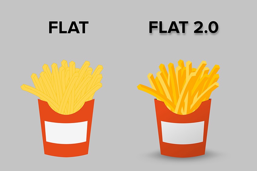
Perhaps the best way to understand the difference is by seeing it in action:

As you can see in the example above, a subtle semblance of realism has crept back into flat design, simply by adding some extra details and elements. The minimalism remains, as evidenced in the clean-cut visuals and the unadorned typography. Yet the use of shadows, gradients, highlights, and extra layers brings a level of three-dimensionality to the design, and thus provides greater clarity for the viewer.
The advantages of Flat 2.0
When used well, Flat 2.0 can be a great choice for UX design. It balances the benefits of minimalist aesthetic, with a more user-focussed sense of functionality. In this way, it is able to address several of the perceived shortcomings of flat design.
Some characteristics of Flat 2.0 include:
3D Interactability — Raised or sunken elements indicate to users that they can engage with an action (such as clicking, tapping, or filling in a field). Use of subtle animations can also be a useful way to guide users to the interactive elements on the page.
Greater detail — Distinct shading and highlighting can create an attractive sense of depth in an image. Meanwhile, adding a meticulous layer of detail (showing the individual pages in a book, the artful grain on a tree, not-quite-focussed elements in the foreground or background, and so on) can take a website from austere to amazing.
Use of icons — Stylistic and simplified icons can be an easy way to communicate information to users. The trick is to use recognisable iconography, the meaning of which is immediately clear to the viewer.
Use of colour — Whether pretty and pastel or bright and bold, Flat 2.0 continues the trend for crisp and clean colour palettes.
Unobtrusive font — Compared to traditional flat design, Flat 2.0 gives designers greater leeway in their choice of typography. However, this will ideally remain simple, oversized, and easy to read.
Flatter your website with great design
Changes in the design world are usually the result of user demand, and Flat 2.0 is no different. Where flat design falls short, Flat 2.0 provides solutions, all while extending and improving the seamless, minimalist, aesthetic appeal that defines the original.
Is it time to reinvigorate your brand with an amazing new design? Whether flat design, Swiss design, skeuomorphism, or another innovative style, nucleo can create usability and charm with the design that’s right for your business.